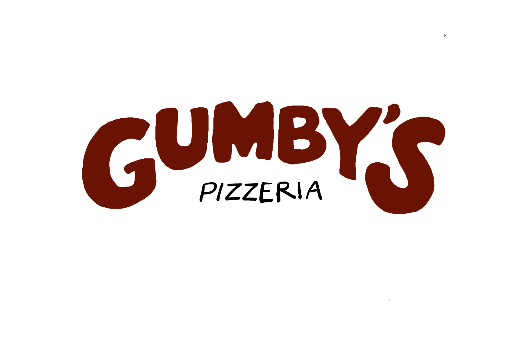
The new & improved Gumby’s Pizza
When I finally decided the direction I wanted to go with the logo, I also felt like the colors needed some help as well. The yellow was too bright and didn’t really match the branding… I think they were thinking the yellow would represent cheese… not their best idea. The green was also an odd shade for a pizza company. And finally, the red was too bright to be resembling sauce or tomatoes.
I replaced the yellow with a dark brown that is a nicer balance as opposed to the black. Instead of the bright yellow, I went with a darker and lighter green. The red is slightly deeper and is complimentary to the greens.
New Menu
Front

Back

Website
Collateral
Business Cards

Pizza Boxes


T-Shirts

Letterhead
Brand Re-Design Project
In this project, I was tasked with picking a local company in College Station, TX to re-invent and re-design their brand. I had to re-design their logo, website, as well as design collateral that was consistent with the new brand personality. I chose Gumby’s Pizza—a local pizza joint that is beloved to the members of the society. Although their pizza is to die for, their original branding was not. Here is how I re-designed Gumby’s Pizza .
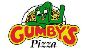
Original Logo
Original Menu

Original Website(s)
Not only was Gumby’s branding and logos inconsistent, they had separate websites for every single location that they have.

College Station location’s website
Secondary Logo?
This was sometimes a logo that they would use in their branding. Pretty inconsistently used as well as being inconsistent with the brand.


The overall website
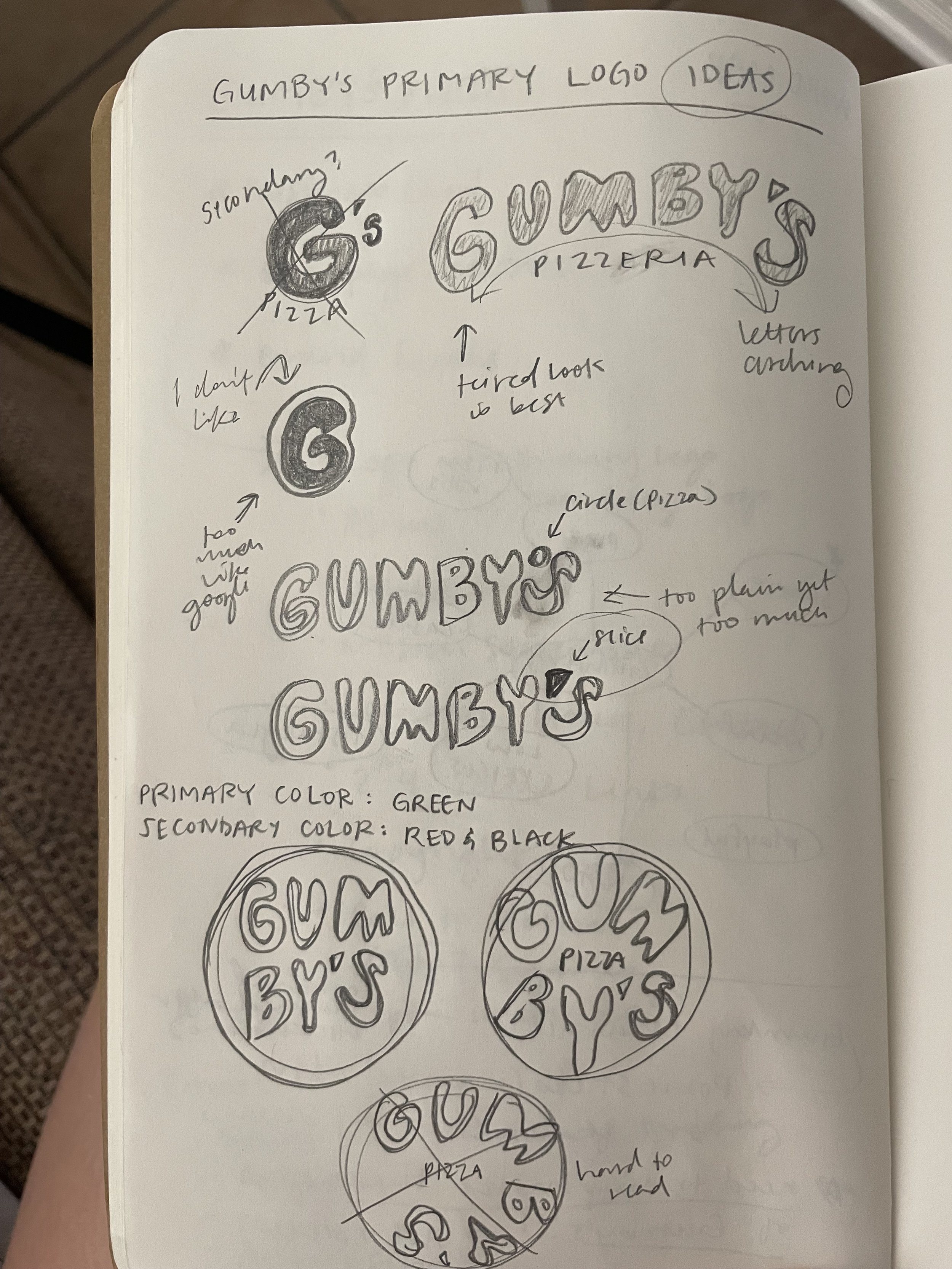

Brainstorming/sketching
I started this project by mind-mapping and doing lots of sketching. I was quick to think that this project would be easy, given that the original logo and branding was not great and there was a lot of room to grow. I was proved wrong and the brainstorming & sketching process was extremely essential to the success of this project.
Inspiration & Mood boards

The original brand personality that is truly what drives Gumby’s business could be described as:
welcoming
come as you are
hole in the wall charm
retro


Initial Logo Sketches

When thinking about the re-design, I didn’t want to change the overall feel of the brand, I just wanted to be able to communicate it better. It was a challenge to think outside the box & try to keep the same feel that Gumby’s gives off.